Overview
- My goal was to create a new online portfolio. It had to have a creative design, be fast to load, and make editing articles easy.
- To satisfy those requirements, I created a personal website that looks similar to MacOS, using Notion as a content management system (CMS). To ensure low latency, I used a custom Notion renderer and a serverless relay with caching.
- The design made the portfolio website unique (creative ☑️). Further, because it relied on Notion as a CMS, updating articles was a breeze (easy updates ☑️) and serving content was snappy due to the relay (speed ☑️).
Context
- 🗓️ Timeline: 03/2023 — 04/2023 (main development)
- 🛠️ Project type: Personal side project
- ▶️ Live Demo: https://personal-website-2023-ochre.vercel.app/intro
- Note that I’m not keeping the content up to date anymore!
Technologies
- Frontend framework: Vue.js
- Styling: TailwindCSS
- Icons: Custom + https://phosphoricons.com
- Wallpaper: Custom, created using https://www.joshwcomeau.com/gradient-generator/
- Notion API Wrapper: https://github.com/splitbee/notion-api-worker
- Vue notion renderer: https://github.com/zernonia/vue3-notion
- Client hosting: Vercel
- Notion API Worker hosting: Cloudflare workers
- CMS: Notion
Impressions
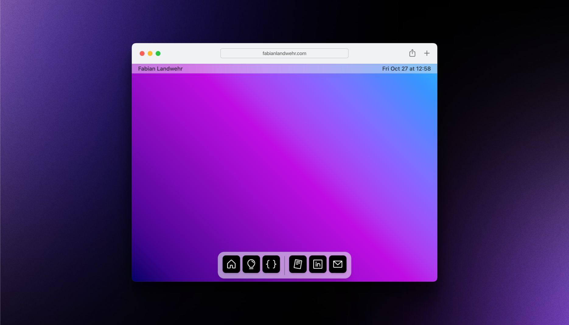
The website looks similar to a MacOS Desktop, with a status bar at the top and a Dock at the bottom:
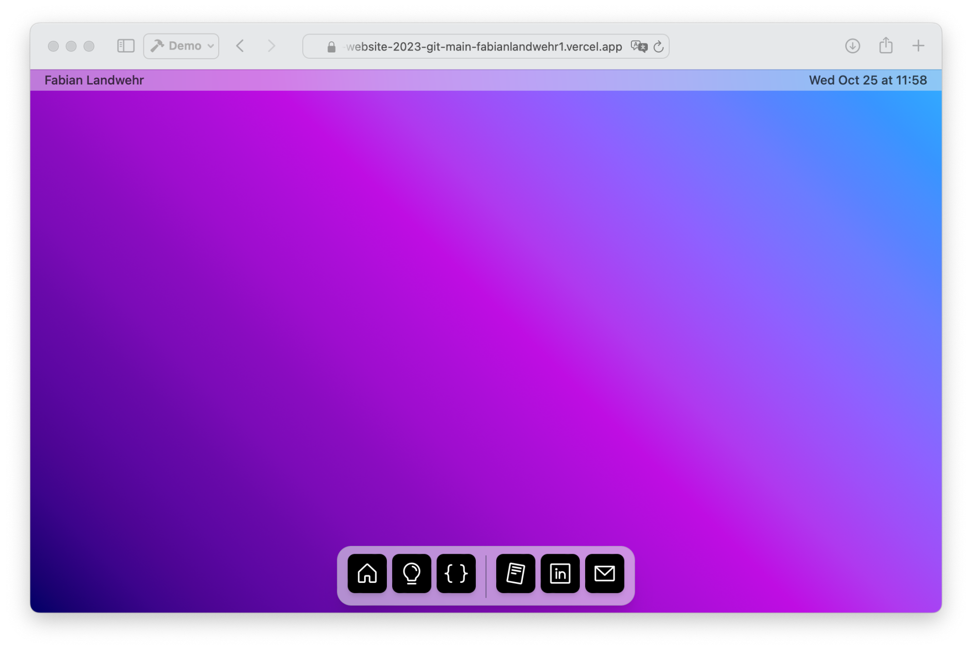
The “apps” at the bottom are the individual pages. From left to right, the apps are:
- Introduction: Short introduction about myself.
- Portfolio: The home for all my past projects.
- How this site was made: An article explaining the design and architecture.
- [External Links]: Links to my CV, LinkedIn, and Email
When initially loading the website, the Introduction page opens automatically, as shown in the following video (5s):
The Dock at the bottom comes with some nice animations, mimicking those of MacOS (15s video):
Pay special attention to the bouncing effect at the end!
All of these animations were created using pure TypeScript, HTML and CSS, leveraging the Window.requestAnimationFrame() function.
I made the website such that multiple windows can be open at the same time, with one window being in focus. The windows can also be dragged around, closed and reopened. The following video (15s) showcases the multi-window functionality:
I designed the portfolio “app” to look like a simplified version of the MacOS Mail app:
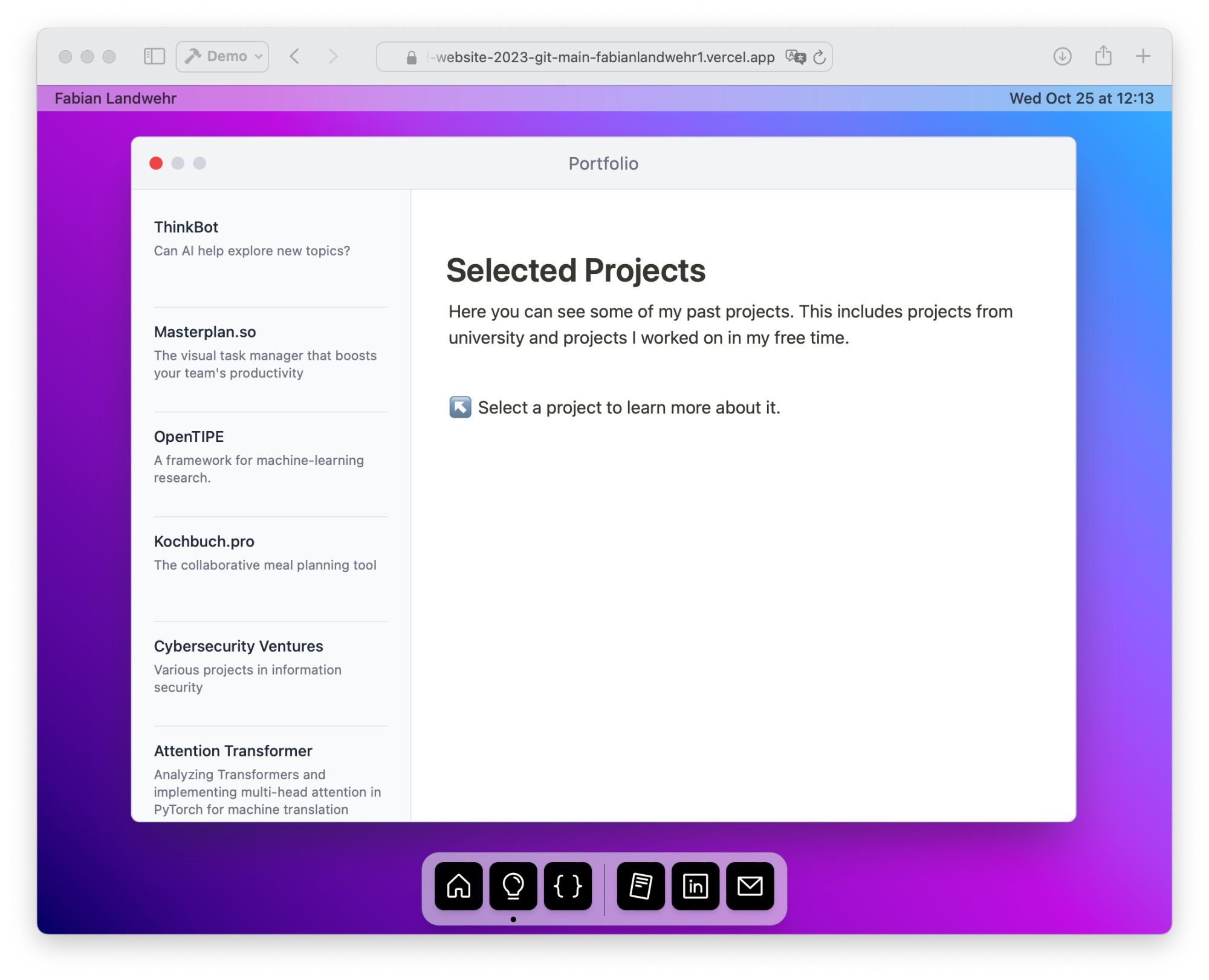
Upon clicking one item in the sidebar, the content, provided by Notion and rendered using Vue.js, is displayed in the main panel:
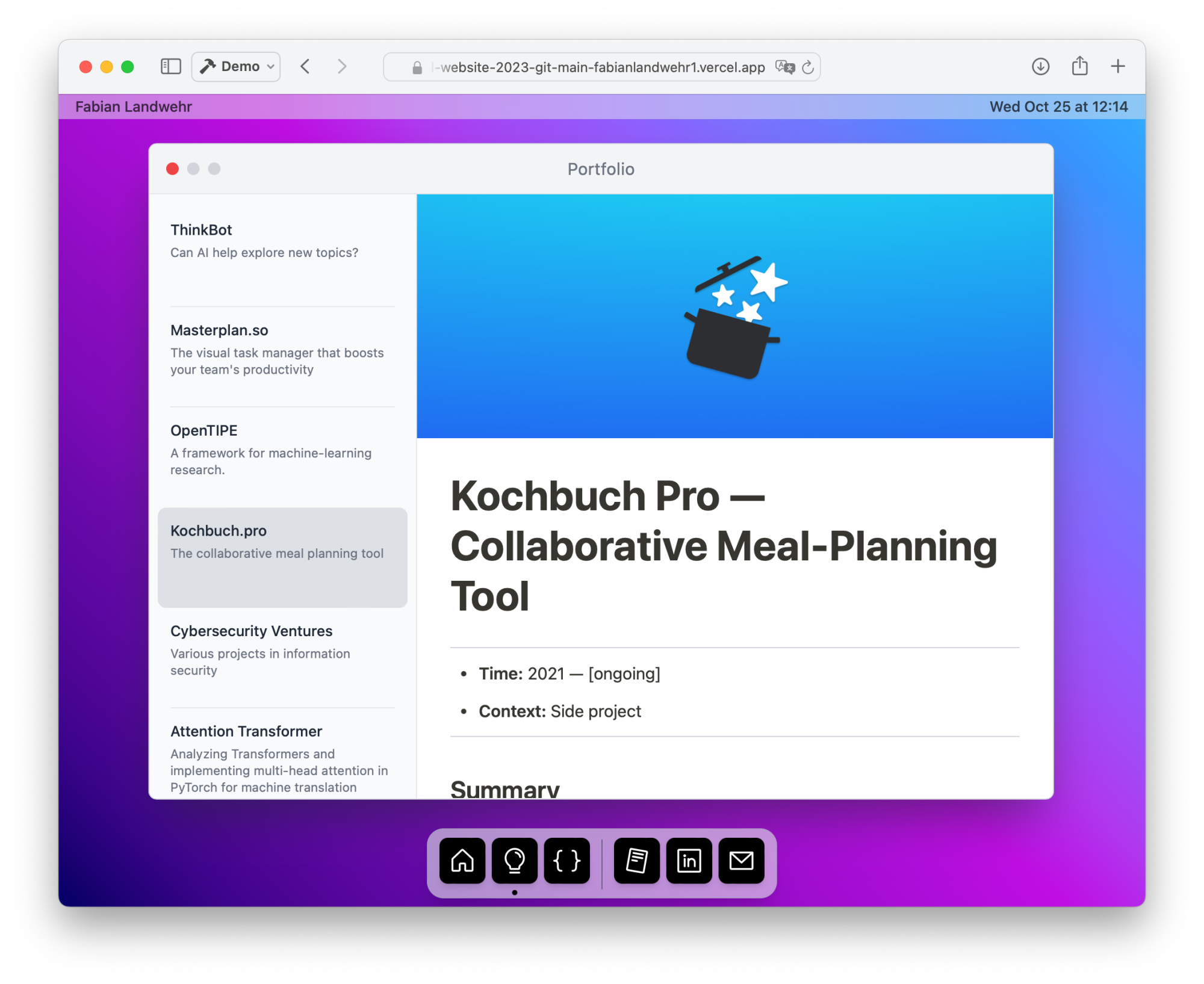
There also is a simplified mobile version of the website, showing the content directly, without having windows:
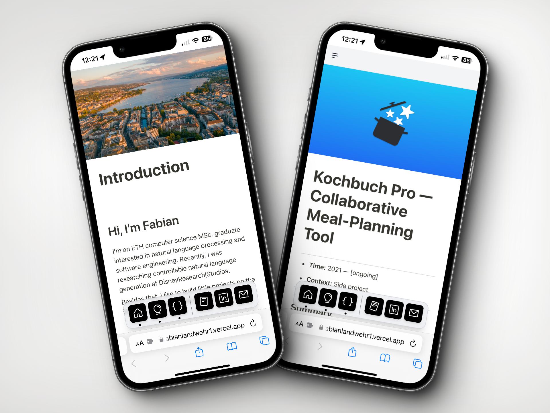
If you are interested, keep on reading to learn more about the architecture of the website:
Architecture
Overview
For the desktop idea (the dock, multiple windows, etc.), the code is straightforward. It uses a reactive framework (Vue) and a lot of CSS (Tailwind) for the bulk of the design. Some of the animations also heavily rely on animation logic written in TypeScript.
The bigger question was: “how can I easily edit articles and display them on my website”? To achieve this, I chose Notion as a content management system and rendered the resulting articles on my website. In order to make the loads performant, I deployed a Notion relay with caching.
The following diagram gives you an overview of how it all works (explained below):
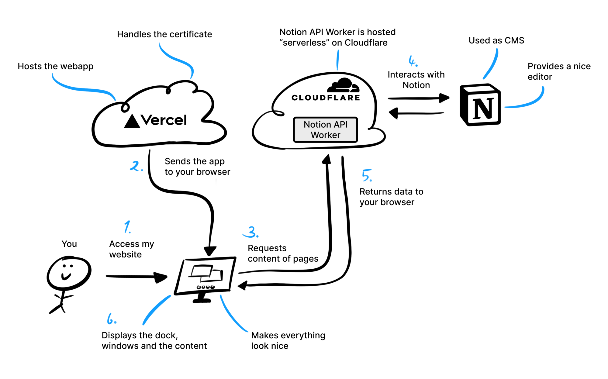
When someone accesses my website, this is what happens
In short, when a user accesses the website, the Vercel platform, which hosts the web application, sends the app to the user’s browser. While accessing the site, the browser makes a request to retrieve page content. This request is managed by the Notion API Worker running on a Cloudflare worker. The API Worker interacts with Notion, a platform used as a Content Management System (CMS), to obtain the required data. Once the data is fetched from Notion, it is returned to the user’s browser, which then displays the content in a visually appealing manner.
Why I’m no longer using this website
While this website meets all initial requirements (It should be fast, easy to update, and creative), some new requirements emerged: I also realized the importance of having analytics and an excellent mobile experience. Due to the nature of this design (imitating a desktop operating system), enabling a great mobile experience is hardly achievable. Instead, I now opted for a simpler website (the one you’re currently viewing), letting the content speak for itself.
